Chapter 3 Anatomy of Data
3.1 What is data? What is information?
3.2 Where does data come from?
All around you!
3.3 What are the types of data?
There are several frameworks to describe different types of data. The Stevens Typology (Stevens, 1946) is the most common among social scientists, so I’ll use its language throughout this book. Stevens describes four types of data:
- Ratio (salary in USD, height in inches, etc.)
- Interval (attitude scales, Celsius and Fahrenheit, etc.)
- Ordinal (strongly agree > strongly disagree, Freshmen < Senior, etc.)
- Nominal (job title, country of birth, etc.)
These characteristics of data are the bedrock for all visualizations. Most graphs only work with certain types of data, so being able to identify these properties in your data will help you more quickly understand the myriad ways you can represent it visually. Let’s go into a little more detail about each type.
Nominal data has no known magnitude or rank order. For instance, we might look at the GDP for a group of countries. Country is a nominal collection of data because the country names simply indicate that the countries are different from one another. Other examples:
- College degree (psychology, business, literature, etc.)
- Colors (red, green, etc.)
- Vehicle manufacturers (Tesla, Audi, Mercedes, etc.)
Ordinal data has an unknown magnitude but a known rank order. Consider a marathon where each runner is given a rank once they finish. We know that the runner who came in first place had a better time than the runner in second place, but we don’t know how much faster they were. Were they twice as fast? Only one second faster? We don’t know, and that’s what makes this data ordinal. Other examples:
- Agreement scales (strongly disagree < strongly agree)
- Job seniority (CEO > vice president > manager)
- Academic grades (A > B > C)
Nominal and ordinal data can be called “categorical” data because they primarily depict different categories. Our next two, interval and ratio, are “continuous” types of data, because they contain values that be anywhere within a given range.
Interval data has a known magnitude and rank order. The Celsius temperature scale is a common example of this, with the range from 0 to 100 degrees providing an even gradient to express the amount of heat. We know that 35 is more than 28.5, and that the difference is 6.5 units. Other examples where interval data might be collected:
- Happiness scales
- Job satisfaction surveys
- Personality tests
Ratio data has a known magnitude and rank order, just like interval data. The difference between these two is that interval data does not have a meaningful zero value, but ratio does. When the temperature reaches 0 degrees (in Celsius), does that mean that there is no temperature? Of course not! The 0 in Celsius is a useful baseline for us in our day-to-day lives, but it isn’t an accurate expression of how quickly a group molecules are vibrating. However, the Kelvin temperature scale was intentionally designed to be a ratio scale, which is why 00 degrees Kelvin is called “absolute zero” and indicates the complete absence of temperature. Here are a few other examples you might come across: * Salary (in dollars) * # Products sold * miles per hour
Most people struggle to spot the differences between ratio and interval data, and that’s okay. It rarely matters for visualizing data, but can be important for other types of data analytics, which is why it’s worth mentioning. There are also some data that can move between categories, such as time or geospatial data. We’ll cover these in more detail in the examples in a later chapter.
The kinds of charts you can build depend on the type of data you want to visualize. This table gives a (non-exhaustive) sampling of the plots that might work for each combination of two variables:
| Variable 1 | Variable 2 | Possible Graphs |
|---|---|---|
| Nominal | Nominal | Chord diagram |
| Nominal | Ordinal | Stacked barplot |
| Nominal | Interval | Spider plot |
| Nominal | Ratio | Jitter plot |
| Ordinal | Ordinal | Heatmap |
| Ordinal | Interval | Boxplot |
| Ordinal | Ratio | Barplot |
| Interval | Interval | Lineplot |
| Interval | Ratio | Scatterplot |
| Ratio | Ratio | Area Chart |
Generally speaking, these four data types are fundamental for understanding the phenomena you wish to represent and the options available for visualizing them. There are, of course, exceptions and special cases that don’t fit neatly into this framework, which is why some academic fields may use a modified or completely different framework altogether. However, for most purposes, the Steven’s typology works well enough.
However, there are some common visualizations that use data in a way that I think deserves their own categories, even though they can (strictly speaking) be placed into one of Steven’s four types. These are:
- Period
- Duration
- Flow
Period and duration data are both used to represent aspects of time. You can think of it as “a time period” (e.g., January 1, 2020 - June 30, 2020) and “a duration of time” (e.g., 4 hours 32 minutes and 18 seconds). Very often, period and duration data needs to be derived from a source of raw data, rather than being stored on its own. Consider a shipping company that is tracking the progress of several trucks in its fleet as they make deliveries. They can very easily log progress with a table like this:
| Truck ID | Status | Time |
|---|---|---|
| 123 | Departure | 2020-03-05 08:17:42 |
| 456 | Departure | 2020-03-05 08:22:06 |
| 789 | Departure | 2020-03-05 08:23:58 |
| 456 | Arrival | 2020-03-05 09:14:33 |
| 123 | Arrival | 2020-03-05 10:02:56 |
| 789 | Arrival | 2020-03-05 10:27:44 |
By storing raw data as precise timestamps, they will always be able to aggregate their records into other useful information, such as:
- How long did it take 123 to arrive at its destination?
- What is the average trip length?
- How many trips took longer than 1 hour?
- and many more!
Flow data is simple to store but represents the complex movements of a “stock,” which is just an amount of something. This can be used to create “stock and flow” diagrams to portray the process of movement, or Sankey diagrams to portray the proportions of movement. Here is a simple example of a stock and flow chart:
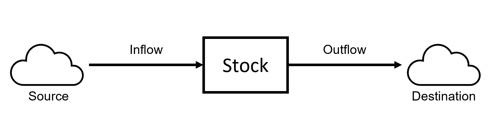 Stock and Flow diagrams model the movement of a stock and the variables affecting it. These emphasize the mechanics and process of the flow, rather than the amounts currently flowing. Relatedly, a Sankey diagram emphasizes the quantities of flow during a given time period. This Sankey diagram shows the (completely fictional) “flow” of students through university. They apply as high-school or transfer students, select a major, and graduate or not:
Figure 3.1: Sankey diagrams depict the sources and flow of a stock, as well as the proportions of their values.
You are probably already familiar with a “flow chart.” These charts are visual depictions of a decision making process, and are rarely (in my experience, anyways) connected to a raw data source. Nonetheless, they are an excellent way to communicate natural phenomena or other processes. These will be covered in chapter [###].
We’ll cover the code to create Sankey diagrams later on.
3.4 How do we visualize data?
We create a graph of data by encoding the values into various visual properties, such as:
- Color
- Length/Width
- Area
- Text
- Angle
- Position
- And more!
Data visualization is the final step in a process of encoding natural phenomena into data and then translating data into visual properties. It seems simple, but these visual properties are the fundamentals of all data visualization. Check out this little simulation to see how these properties change with your data:
Information is always lost in translation, and data visualization is no exception. Sometimes, we fail to capture important information about the phenomena into the data we store. For instance, you may have taken an employee experience survey that asked you to “rate your job satisfaction on a scale from 1 to 10 (highest).” The data we capture is incredibly simple (an integer between 1 and 10), but your holistic experience on the job is rich and nuanced and detailed and diverse! A great deal of information about the phenomena we’re interested in is not captured with this question. That doesn’t mean it’s a bad question, only that there’s a gap between the reality of the phenomena and the data we’ve captured. We could ask the same question, but instead of requiring a numeric response, allow the employee to write a text response. This would certainly capture more information about their true experience, but this type of data is much more complex to work with and derive insights from. In this way, the data we capture is the first (and usually biggest) limitation on our ability to understand the world around us.
Other times, our visualizations fail to capture meaningful aspects of our data (and thus, the phenomena itself). After surveying 100 employees, we might use a bar plot to show that the average job satisfaction score is 9.2 out of 10. Yahoo! But the average score of all 100 employees is only one piece of information, and we might have several other questions: What was the lowest and highest scores? Did the scores vary by work team? Have scores gone up or down over time? How do these scores compare to other similar companies? And so on.
Generally speaking, more information is lost during the translation from reality to data than from data to visualization. Gathering data which faithfully and fully represents natural phenomena is difficult, tedious, and complex. Scientists spend years learning about a particular category of phenomena (medicine, biology, psychology, etc.) and being trained in the methods to capture meaningful data related to their discipline. This book mostly deals with the second phase of translation: data to visualization. It contains numerous examples of visualization techniques, describes the terminology and proper usage of various charts and graphs, and provides the statistical code to reproduce the examples in the R programming language.
3.5 How does the computer store data?
Unfortunately, it’s unlikely that you’ll actually encounter something labeled as “ratio” or “ordinal” data. Those terms help you think about what kind of phenomena is represented by the data, not how the data is being stored in the computer. When you have a dataset in R, you can see how the computer is storing each column using the str(name_of_object) command. Here are the most common storage types and their (likely) counterpart in the Steven’s typology:
Ratio and Interval
num(numeric)int(integer)dbl(double-point floating precision number)
Ordinal
Ord. Factor(Ordered Factor)int(Integer)chr(character string)logical(true or false)
Nominal
* Factor (Factor)
* chr (character string)
* logical (true or false)